This is part two of our two-part data assimilation series. Looking for part one? Access it here.
In part one of our data assimilation series, we introduced the concept and explained how the incorporation of critical wave direction and period information has improved our team’s ability to produce accurate, real-time weather forecasts. Now, let’s take a look at a real-world data assimilation scenario.
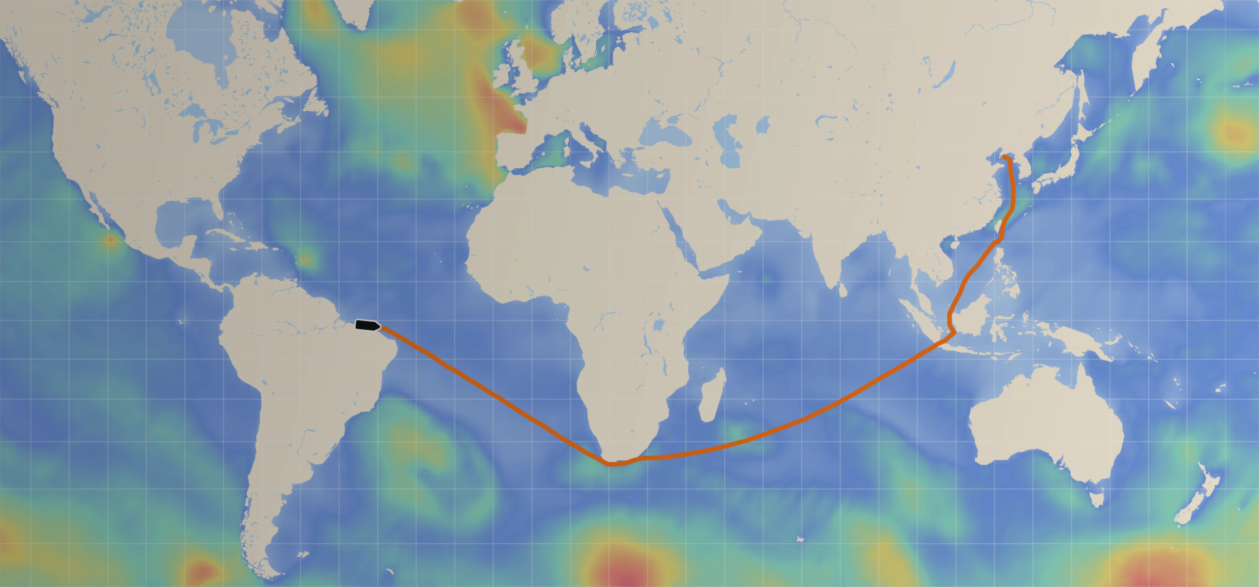
In March 2022, a cluster of our Spotter buoys were on the edge of a large storm in the North Atlantic Ocean. To test the efficacy of our data assimilation approach, let’s compare the accuracy of two forecasts of this storm:
The top-most panel in Figure 1 below shows the forecast initial state from the Sofar Operational Forecast, which assimilates Spotter buoy data. The middle panel in Figure 1 shows the same forecast without data assimilation. The bottom-most panel in Figure 1 shows the numerical difference in the significant wave height forecasted at different points by the Sofar Operational Forecast and the “No Data Assimilation” forecast.

At first glance, the Sofar Operational Forecast (“Data Assimilation”) in the top-most panel and the “No Data Assimilation” forecast in the middle panel look quite similar. However, when we analyze the differences in significant wave height shown in the bottom-most panel, we start to see very large divergences, in some cases up to five feet! Forecast deviations of this size represent the difference between a safe and unsafe voyage, offshore worksite, coastal community, etc. A ship at sea that is accessing the Sofar Operational Forecast via our Wayfinder tool, for example, would receive updates that tell a more accurate story about this severe storm, its large waves, and the vast geographic area that it covers.
While Figure 1 shows only the initial state of the forecasts, we can also go back in time to see which forecast tracked more closely to the actual observations made by the Spotter buoys on the edge of the storm.
At each buoy, the Sofar Operational Forecast outperformed the “No Data Assimilation” forecast, predicting wave heights closer to what the buoys actually measured. This performance gap is illustrated in Figure 2. Each Spotter buoy's observed wave height (dark blue bar) represents the actual type of wave that, say, a container ship would encounter as it passed through the storm. The wave height forecasted by Sofar’s Operational Forecast (“Data Assimilation”, light blue bar) and the wave height forecasted by the “No Data Assimilation” forecast (blue-gray bar) represent the information that a container ship Captain would have access to 12 hours prior to encountering the storm system.

While these differences may seem small, to a frequent user of ocean data, they can be critical; shipping companies, for instance, need accurate, real-time wave data to avoid turning optimized voyages into inefficient, weather-restricted journeys.
The power of data assimilation lies in its ability to use real-time, in-situ observations to continuously improve weather forecasts in the future. At Sofar Ocean, we are proud to be helping pioneer use of this data technique from the coasts to the open ocean, and are excited to continue to refine our approach.
Missed part one of our data assimilation series? Check it out here. Stay tuned for future blog posts detailing the evolution of our data assimilation approach.
--
Updated July 26, 2022