Back

How assimilating wave spectra improves ocean weather forecasts

Sofar Ocean

What are wave spectra?

Wave spectra convey the distribution of wave energy over different directions and frequencies. They add a new element to ocean weather forecasts not captured by integrated wave statistics, such as significant wave height. Observations of wave spectra can tell us what direction the wave energy is traveling to, how energetic the waves are, and what the dominant wave period is; observations of significant wave height, on the other hand, can only tell us information about wave magnitude.

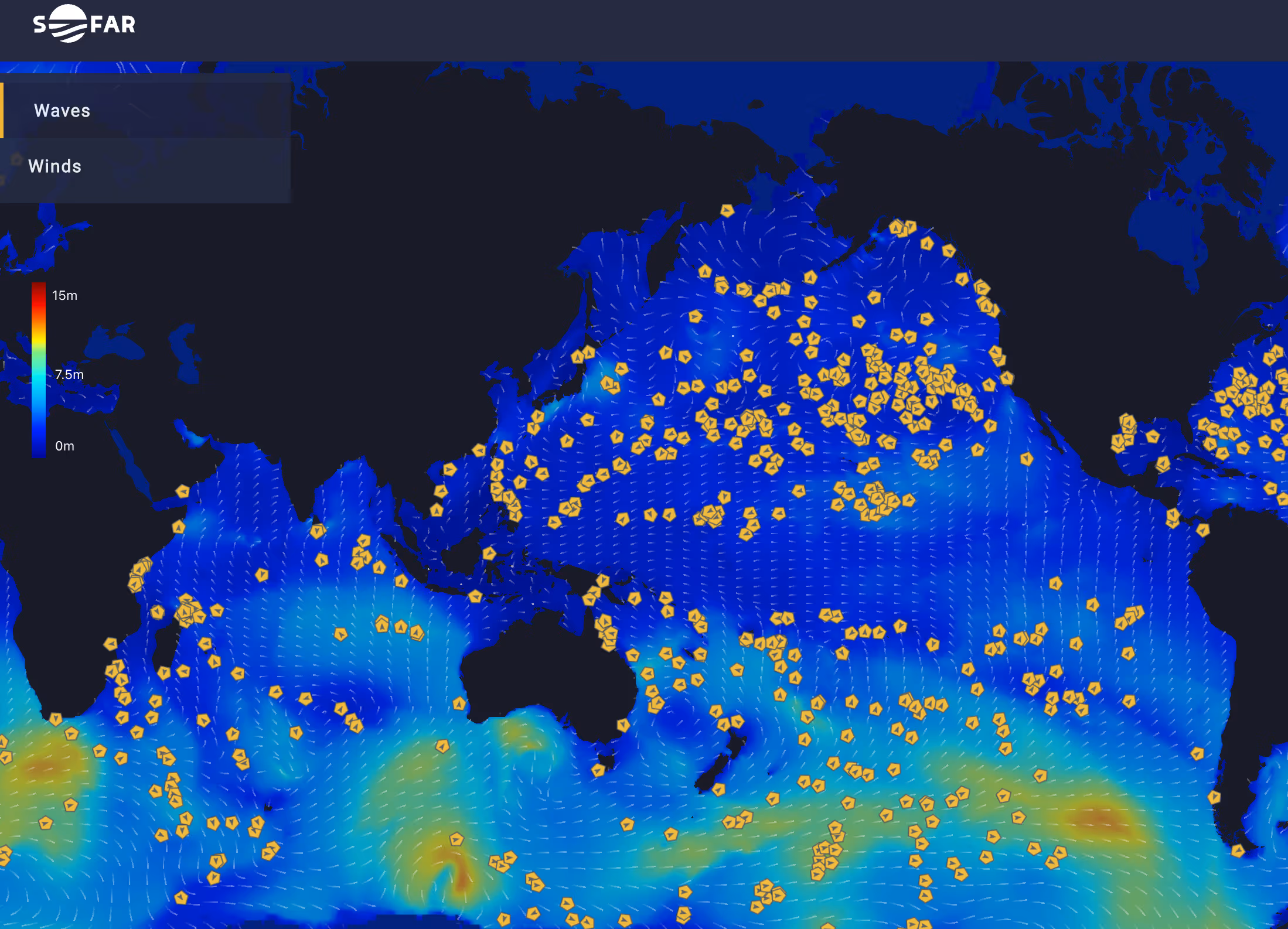
Sofar’s operational ocean weather forecasts assimilate observations of wave spectra made by the global network of Spotter smart buoys. In fact, the “distributed [Spotter] sensor network opens up the opportunity to develop the first operational spectral wave-DA [data assimilation]” forecast. By assimilating buoy observations of wave spectra, along with satellite and widely-available in situ data, Sofar increases the accuracy of its marine weather forecasts, which outperform existing models by 40-50%. (Source)

Let’s visualize the components of the wave spectrum and demonstrate how assimilating wave spectra improves forecast accuracy.

How to visualize the wave spectrum

In Figure 1, a deconstructed polar plot shows the wave spectrum.

Figure 1. A deconstructed polar plot showing the wave spectrum: direction (left), frequency (middle), energy (right).
  • Direction: the polar coordinates in the leftmost graphic show the direction that the waves are traveling to. Like a needle on a compass, the position of the wave energy (colored area) on the polar plot indicates what the wave direction is.
  • Frequency: the radius of the polar plot in the middle graphic shows the wave frequency. When the wave energy is closer to the center of the polar plot, the wave frequency is lower (i.e., ocean swell). When the wave energy is further from the center of the polar plot, the wave frequency is higher (i.e., wind waves). 
  • Energy: the colored areas in the rightmost polar plot convey wave energy, with warmer colors representing more energetic waves. When the waves are at their most energetic, a deep red zone is visible.

Spotter observations of wave spectra provide a granular view of the wave dynamics that the buoy is sampling. The wave spectrum in Figure 1 describes wave energy traveling to the northwest with a dominant wave frequency of 0.1 Hz, or a wave period of 10 s.

Now, let’s explore how these observations are assimilated into Sofar’s forecast and used to improve forecast accuracy. 

Using wave spectra to improve forecast accuracy 

The top row of Figure 2 below shows three polar plots:

  • The top left plot (Spotter) shows the observations of the wave spectrum recorded by a Spotter buoy as Hurricane Ian passed to its west (see map in bottom left). These observations of wave direction, frequency, and energy serve as a benchmark, or ground truth, to assess forecast accuracy.
  • The top middle plot (Spectral Analysis) shows a Sofar forecast that assimilates the observations of wave spectra recorded by the Spotter.
  • The top right plot (Significant Wave Height Analysis) shows a Sofar forecast that assimilates only the observations of significant wave height recorded by the Spotter.

To determine which forecast is more similar to the ground truth Spotter observations, we compare:

  • The difference between the wave spectrum forecasted by the Spectral Analysis and the observations of the wave spectrum made by the Spotter (Spectral Analysis - Spotter)
  • The difference between the wave spectrum forecasted by the Significant Wave Height Analysis and the observations of the wave spectrum made by the Spotter

Both are plotted in the bottom row of Figure 2.

Figure 2. Top row (left to right): a polar plot of the Spotter buoy’s observations of the wave spectrum; a Sofar forecast of the wave spectrum that assimilates observations of the wave spectrum made by the Spotter; a Sofar forecast of the wave spectrum that assimilates the observations of significant wave height made by the Spotter.
Bottom row (left to right): a map showing the position of the Spotter (yellow pentagon), with a color gradient of significant wave heights generated by Hurricane Ian to its west; a polar plot showing the difference between the wave spectrum forecasted by the Spectral Analysis and the wave spectrum recorded by the Spotter
; a polar plot showing the difference between the wave spectrum forecasted by the Significant Wave Height Analysis and the wave spectrum recorded by the Spotter.

The Spectral Analysis is more aligned with the Spotter observations than the Significant Wave Height Analysis. Assimilating the observations of wave spectra corrects information about the wave frequency, direction, and magnitude. When a forecast assimilates just significant wave height, it only corrects information about the wave magnitude; as a result, the Significant Wave Height Analysis incorrectly predicts too much northward wave propagation and distributes the hurricane’s wave energy over too wide of a range of directions.

The assimilation of Spotter observations of wave spectra helps Sofar maximize the accuracy of its operational ocean weather forecasts. To learn more about wave spectra, check out our mini-blog further analyzing the observations of wave spectra made by the Spotter buoy, referenced above, that passed near Hurricane Ian.

To receive the latest ocean science and weather forecasting posts in your inbox, subscribe to our blog. To speak with a Sofar representative, schedule a Spotter smart buoy demo or Data Services demo.

Sofar in the News
In the News
February 26, 2024
Better, Faster, Sooner: Voyage optimization goes digital
In the News
October 23, 2023
Wayfinder delivers 8% total equivalent fuel savings on Brazil-China (BDI C14) voyages arriving in early October
In the News
October 2, 2023
What was different about the latest Advanced Naval Technology Exercise

Related Stories